Should You Use Pop-Ups on your Website?
If there is one thing that will get marketers arguing and gnashing their teeth, it is the question of whether pop-ups should be used or not. Some pop-ups might make your website take longer to load, which irritates and frustrates your users and makes for a bad user experience (UX). If the website doesn’t load quickly, it will hurt your SEO and your readers will probably leave your site and go to one of your competitors.
What Are Pop-Ups?
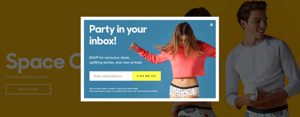
Pop-up ads or pop-ups are forms of online advertising on the Web or on your website. A pop-up is an advertisement usually in a small window, that suddenly appears in the foreground of what is being viewed. For that alone, in its simplicity, it is annoying. Just like you are being interrupted when talking to someone. However, if done correctly it can be extremely effective in converting readers to customers
The 5 Basic Types of Pop-Ups.
Entry pop-ups; These ads. pop up before a page fully loads or straight after the page is loaded. The user has just entered the website and they are hit with a pop-up even before they fully understand what the content is about. A surefire way to turn off your reader.
Click pop-ups; When a user clicks a specific link, picture, or word, they are activated. The least obnoxious pop-ups for consumers, in my opinion, are those that require user action. They work subtly without posing any harm to website conversion and only appear when visitors wish to see them.
Click pop-ups don’t put users under any strain, give them the impression that they are still in control of their browsing, and foster a feeling of security and comfort. Thus reducing the gnashing of teeth and feelings of frustration.
Sidebar scroll pop-ups; Due to its appropriate placement and timing, this form of pop-up appears the least threatening. They are shown when visitors have a solid understanding of the material and are likely to continue browsing the website in spite of a pop-up.
A sidebar popup does not annoy the user because it does not impede page content, unlike overlay or full-screen popups. So even with the pop-up doing its thing the reader can continue to read the content without that feeling of being interrupted.
A timed pop-up. A pop-up that appears to a website user after they have been on the site or page for a certain amount of time is exactly what it sounds like. Through a series of experiments to evaluate which one is most effective, precise timing is established.
Pop-ups that are time-triggered (they appear after a set period of time) will appear when consumers are most likely to be interested in the specific topic or product talked about. The success of these pop-ups continues to be largely dependent on when they are displayed.
Exit-intent pop-ups.
The exit pop-purpose up’s is to present a compelling offer to users before they leave a website. Website owners frequently employ various bonuses, discounts, or other seemingly attractive offers to do this. These pop-ups are also displayed during the purchasing process to encourage customers to place a purchase.
Unexpectedly, there are a ton of people that dislike this helpful tool. However, these pop-ups can be rather pushy if not done sensitively. . Once more, just as with entry pop-ups, you need to find strong motivation to sway the reader. You’re better off not offering anything if the offer is only mediocre because a poor exit pop-up will cause more harm than good.
The Pros of Pop-Ups.
Cost: They’re inexpensive. There are several plugins that provide them as a service if you use WordPress. Some have restrictions and are free, while others charge but offer greater functionality.
Visibility – Wherever you decide to have them come up, they’re right there in the foreground or at the bottom.
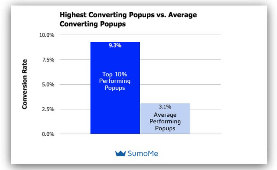
They are mostly used by websites for conversion purposes, and they are effective at turning visitors into subscribers. Including a pop-up on your website can boost conversions up to 9.3% 35%. That’s a LOT. Source SUMO

Top Pop-Up Conversion Rates.
Conversion rates for some pop-ups can reach 50.2%. But the best pop-ups had an average conversion rate of 9.28%.
To put that into perspective, 418 signups would occur in a month if your site received just 150 visitors every day.
If you had a conversion rate like that, you would be among the top 10 percent of pop-up designers.
The Average Pop-Up Conversion Rate.
Pop-ups generally come into this category. The average serves as both a benchmark and a warning about what high traffic volumes can do to conversion rates.
Your conversion rate will (generally) decrease as increased traffic brings you more pop-up impressions. Therefore, even though 3.09 percent might seem insignificant, suppose your website receives 100,000 visitors. That turns into 3,000 subscribers.
The Cons of Pop-Ups.
People either love them or hate them. Even marketers have mixed emotions about using them. There is no denying the statistics and the benefits that can be achieved by a well-thought-out and placed pop-up, but peoples reactions remain the same. Love or hate. and that is hate with a passion.
One pop-up blocker is enough. Putting too many on your site will cause people to exit because they can’t get to the information that they came for in the first place. Quite often, you’ll see multiple pop-ups for the same offering which is redundant, spammy, and damned annoying.
Pop-Up Blockers – With the news that Google is going to start cracking down on pop-up ads, you may have to rethink them once they’re installed. Pop-up blockers can also be easily installed as a browser extension.
WordPress Plug-ins.
If you are like me, and 40% of website owners who use WordPress you can find a Pop-Up plug-in that will suit you. The plug-in I have currently started using is called poptin, and I have found it to be intuitive and easy to use with no functionality problems.

Installing and Activating Poptin.
Here is a very short video showing how easy it is to use and set up. You have options for each different type of pop-up and an incredible range of options to personalize it. Find out more information at Poptin.
Final Thoughts.
Depending on your goals, choose the ideal pop-up for your website. Make sure your pop-up is clear, brief, and contextually appropriate for the topic of your material. Make sure the pop-up is pertinent to the material, by way of example. You don’t want to be discussing gardening and then have pop-up advertising laptops.
By grabbing users’ attention and promoting deals, bargains, and other promotions, pop-ups can increase user engagement. Additionally, pop-ups let website owners lower bounce rates by identifying users who are about to leave and contact them for their email addresses, phone numbers, etc. When utilized correctly, they can be of tremendous assistance, but when used incorrectly, they will cost you readers, due to poor user experience.
Any or all links on this site may be affiliate links, and if you purchase something through those links I will make a small commission on them.
There will be no extra cost to you and at times due to my affiliation, you could actually save money.
You can read our full affiliate disclosure here.

