
Designing Websites for Mobile Phones.
Designing your website for mobile phones is essential for providing a seamless and user-friendly experience to your mobile visitors. Here are some ideas and best practices.
Responsive Design.
Go for a responsive design or theme., which automatically adjusts the layout and elements of your website to fit different screen sizes and orientations. This ensures that your website looks and functions well on mobile devices.
If you are using WordPress, GeneratePress are some of the best themes you can get. You also have a lot of plugins you can use. but more on that later.
Mobile-Friendly Navigation.
Simplify your website’s navigation for mobile users. Use a mobile-friendly menu, such as a hamburger menu, to conserve screen space. Ensure that your menu and links are easily accessible and clickable, with enough spacing between elements to avoid accidental clicks.
Clear and Concise Content.
Condense your content to fit smaller screens without losing its clarity and impact. Prioritize the most important information, and use shorter sentences and paragraphs to make your content scannable. Break content into sections with headings to improve readability.
Make sure the size of the letters are big enough to see on a mobile phone. I was asked by “Google” to increase the “font” size, so you do not want to upset Google. Once I had done that my rankings went up.
Optimize Images.
Compress and optimize images for faster loading speeds on mobile devices. Use the correct image sizes to avoid unnecessarily large files that can slow down your website. Consider using image formats like JPEG or WebP, which provide good quality with smaller file sizes.
How to do it.
Resize and Crop Images.
Ensure that your images are the right size and cropped to fit the mobile screen. Using large images that are not optimized can slow down page loading times.
Resize the images to the dimensions required for mobile devices.
Compress Images.
Image compression reduces the file size of images without significant loss of quality. Use efficient image compression techniques to minimize the file size, such as saving images in optimized formats like JPEG or WebP.
There are many tools available, such as Adobe Photoshop, TinyPNG, or Squoosh, that can help you compress images effectively.
Then you need to think about how fast your images load onto your website or blog. And this can be done by Lazy loading…
Lazy Loading.
Implement lazy loading defers the loading of off-screen images until they are needed. This technique is particularly useful for long-scrolling pages and ensures that only the images visible to the user on their mobile device are loaded initially, improving page loading speed.
Here are a few you can use, but there are a lot in the marketplace.
LazyLoad
LazyLoad is a lightweight JavaScript library that slowly but speedily loads images as they become visible on the users screen.
It helps reduce initial page load times by delaying the loading of “below-the-fold” images until they are needed. LazyLoad is easy to implement and can be customized to fit your specific requirements.
Echo.js.
Echo.js is another lightweight JavaScript library for lazy loading images. It utilizes data attributes in HTML tags to conditionally load images only when they are visible to the user.
Echo.js automatically detects the user’s screens and loads images accordingly, minimizing unnecessary network requests.
Intersection Observer API.
The Intersection Observer API is a built-in browser API that allows you to efficiently track and react to changes in the visibility of DOM elements.
It is used for lazy loading images, among other purposes. Intersection Observer provides a more efficient and performant way to achieve lazy loading compared to manual scroll event listeners.
WP Rocket.
WP Rocket is a premium WordPress caching plugin that offers lazy load functionality as part of its feature set.
It provides a user-friendly interface for enabling lazy loading of images, videos, and iframes with just a few clicks. WP Rocket is specifically designed for WordPress websites and can help optimize performance across the entire site. And it is the one I use.
Just check that whichever you choose is compatible with your website and theme.
Appropriately Sized Buttons and Links.
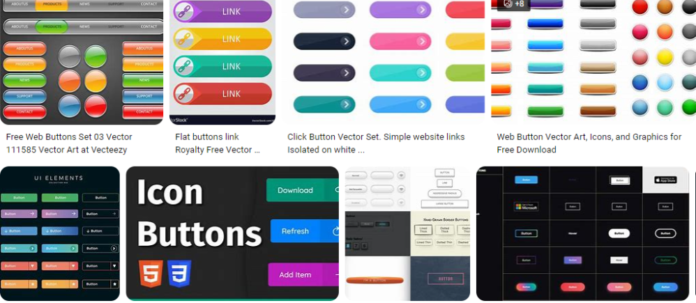
Make sure that buttons and links are large enough to be easily tapped with a finger. Use a minimum target size of 44px by 44px to accommodate different screen sizes and users with varying dexterity.
Provide enough spacing between clickable elements to prevent accidental taps. And check each post you do on your mobile phone to make sure it works.
Next…
Minimize Pop-ups and Interstitials.
Avoid intrusive pop-ups or interstitials that interfere with mobile browsing. Intrusive elements can frustrate users, negatively impacting their experience. If you need to include any, make sure they are easily closable and do not cover the majority of the screen.
With this website I only use 1 pop-up which I believe is helpful, and no more.
More about pop-ups here with my favorite tool Poptin.
And if you are using any forms that need to be filled in,please do this.
Streamlined Forms
Make any online forms easy to use and simplifying the input process. Use autofill suggestions where possible to make it easier for users to complete forms on mobile devices. Display clear validation messages if there are any errors in form submission.
Tools You Can Use.
There are several tools available to help you create streamlined forms for mobile phone websites. These tools offer user-friendly interfaces, templates, and customization options.
Here are a few of them, to keep this post short.
Typeform.
Typeform allows you to build interactive and mobile-friendly forms with a simple drag-and-drop interface. It provides a wide range of question types, customizable designs, and templates. Typeform also offers features like conditional logic and real-time form preview to ensure a smooth and engaging user experience on mobile devices.
JotForm.
JotForm is a versatile form builder that offers a mobile-friendly experience. It provides an extensive collection of form templates, responsive design options, and integrations with popular apps and services. JotForm allows you to create forms with conditional logic, accept payments, and generate reports, making it suitable for a variety of mobile form use cases.
Wufoo.
Wufoo offers a user-friendly form builder with responsive design capabilities. It provides a range of customization options, including form templates, color schemes, and fonts. With features such as conditional logic, file uploads, and seamless integrations, Wufoo simplifies the process of creating and embedding mobile-friendly forms on your website.
Google Forms is a popular and free tool for creating simple forms. While it may have a more basic feature set compared to other form builders, it works well for straightforward form needs. Google Forms is mobile-responsive by default, making it convenient for mobile users.
Formstack.
Formstack allows you to build mobile-responsive forms with a simple drag-and-drop editor. It provides various customization options, including pre-built templates, conditional logic, and integrations with popular apps. It also offers advanced features such as data routing, electronic signatures, and custom calculations.
These tools can help streamline the design and functionality of forms on mobile websites, I have provided a link to Google forms who I believe will start you off really well.
And yes, I am sucking up. Lol.
Now we need to talk about making your stuff fast.
Page Speed Optimization.
 Mobile users expect fast loading times.
Compress and optimize your website’s code, minimize HTTP requests, and leverage caching to improve page load speed. Monitor your website’s performance using tools like PageSpeed Insights or GTmetrix (See below) and make necessary optimizations.
There are several excellent page speed optimization tools available for optimizing websites for mobile phone viewing. These tools help identify performance bottlenecks and provide recommendations to improve speed and user experience.
Here are some of the best tools you can use.
This tool by Google analyzes your website’s performance and provides a detailed report with suggestions for improving both mobile and desktop page speed. It provides a score out of 100 along with specific optimization recommendations.
GTmetrix is a popular page speed tool that provides a comprehensive analysis of your website’s performance. It measures various metrics, including page load time, page size, and the number of requests. It also offers performance scores and actionable suggestions for optimization.
This tool allows you to test your website’s speed and performance from different locations and devices, including mobile devices. It provides detailed performance metrics and a waterfall chart that visually represents the loading process. WebPageTest also offers advanced settings for in-depth analysis.
Pingdom offers an easy-to-use and comprehensive website speed test tool. It provides a performance grade, load time, and detailed insights into each component of your website. It also allows you to test from different locations and view the results for mobile-specific devices.
Lighthouse.
Lighthouse is an open-source tool built into Google Chrome’s developer tools. It offers audits for performance, accessibility, SEO, and more. Lighthouse provides specific recommendations for improving mobile performance and user experience.
AMP (Accelerated Mobile Pages) Validator.
If you have implemented AMP on your website, the AMP validator is a crucial tool. It checks your AMP pages for compliance with the AMP standards, ensuring optimal performance and lightning-fast loading times.
Use these tools to identify areas for improvement, implement the recommended optimizations, and regularly retest your website to monitor its performance.
Prioritize critical recommendations, such as optimizing images, minifying code, leveraging browser caching, and reducing server response time.
And don’t forget your SEO, Search Engine optimization.
Mobile SEO.
 Follow mobile SEO best practices, such as using mobile-friendly URLs, ensuring mobile-specific metadata and schema markup, and optimizing for local searches if applicable. Mobile-friendly websites tend to receive better search engine rankings, driving more organic traffic.
What is Metadata and Schema markup?
Metadata and schema markup are both important elements in optimizing web pages for search engines. Here’s a breakdown of what they are.
Metadata.
 Metadata refers to the information embedded within the HTML of a webpage that provides metadata elements or metadata tags. These tags help search engines understand the content and context of the webpage. The two most common metadata elements are:
Title Tag: The title tag appears in search engine results as the clickable headline for a webpage. It should be concise, accurately describe the content, and include relevant keywords.
Meta Description: The meta description is a short summary of the webpage’s content that appears below the title tag in search engine results. It should be compelling, relevant, and encourage users to click through to the webpage.
Metadata plays a vital role in attracting users to click on search engine results, and optimizing it improves the web page’s visibility and click-through rates.
Schema Markup.
 Schema markup is a structured data vocabulary added to HTML code using schema.org specifications. It provides additional context and meaning to search engines about the content on a webpage. Schema markup helps search engines better understand the webpage’s data and present it in rich snippets or knowledge panels in search results.
it can be used to define specific elements such as product information, reviews and ratings, event details, recipes, local business information, and more. By implementing schema markup, web owners can increase the likelihood of their content being featured favorably in search results
In summary, metadata and schema markup are valuable techniques for optimizing webpages for search engines. Metadata elements like title tags and meta descriptions help improve search visibility and click-through rates, while schema markup provides structured data that enhances search engine understanding and presentation of webpage content.
Final Thoughts.
A mobile-first approach to website design is crucial, as more and more users access the web primarily through mobile devices. Prioritize usability, speed, and simplicity to provide an easy and optimal mobile browsing experience.
My name is Steve and I try to help those who want to get ahead.
If you want to learn all this stuff check out Wealthy Affiliate.
Any or all links on this site may be affiliate links, and if you purchase something through those links I will make a small commission on them.
There will be no extra cost to you and at times due to my affiliation, you could save money.
You can read our full affiliate disclosure here.